

After watching The Flerlage Twins “Do Cool Stuff with Tableau” demonstration at Tableau conference I saw some tricks to how they create buttons by parameter actions. The Data School have an article of creating custom parameters where by you add a new data source or .csv file with the name of the parameters and then using that sheet to control a worksheet that uses the parameter actions. This is a method that I’ve used in the past. Current Iron Viz champion Ann Pregler also has a instructional blog post on how to create Parameter Changing Buttons too.
Well…there is also another way to do this using Map Layers and guess what? No data densification or extra worksheets are needed. Just an understanding of the MAKEPOINT() function.
I’ve created a Tableau Public dashboard with a bunch of different buttons, toggles and switches to choose from so please feel free to download and reverse engineer the workbook or follow the instructions below.
Like all Map Layers tutorials we start with the MAKEPOINT() function and in this example we’re going to create three buttons that allow the user to switch metrics between Sales, Profit and Returns. We’ll create an Oval button selector and a Bar selector.


So what does the MAKEPOINT() function do?
The MAKEPOINT(y, x) creates a spatial placement, which is basically plotting a data point on an XY pane.
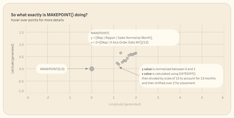
Initial Parameter and Calculation Setup
I suppose first things first let’s create a parameter to switch between metrics:
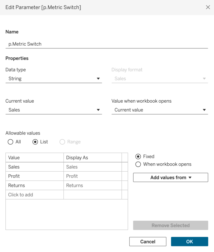
Use the below calculation to use as your measure value when building your charts. This is probably the most common way to set up your parameter calculations when switching between parameters.
//c.Metric SwitchCASE [p.Metric Switch] WHEN 'Sales' THEN SUM([Sales]) WHEN 'Profit' THEN SUM([Profit]) WHEN 'Returns' THEN COUNT([Returns])END
Oval/Square/Tab Key Calculations

Now we have a somewhat better understanding of MAKEPOINT() and our parameter calculations set up, lets go ahead and create the calculations needed to build this visualization and you’re about to be amazed at how simple it is.
Button Placement Calculations
This first set of calculations place the buttons in the three spots:
//c.Map | Button HZ (0, 0)MAKEPOINT(0,0)//c.Map | Button HZ (0, 2)MAKEPOINT(0,2)//c.Map | Button HZ (0, 4)MAKEPOINT(0,4)

To create the view above you will need to:
- Drag each ‘c.Map | Button HZ’ calculation into the view and add a new map layer
- Change each mark to a Shape
- Go to Map -> Background Maps from the toolbar and select ‘None’
Now that we have the initial points plotted we just need to create calculations that will turn each selector on and off and format them how we want.
Oval Formatting Calculations
Use the below calculations to help format and label the buttons. These four calculations will be created for each metric:
//bool.Map | Sales OnIF [p.Metric Switch]='Sales' THEN TRUE ELSE FALSE END//l.Map | Sales OnIF [p.Metric Switch]='Sales' THEN 'Sales' ELSE NULL END//l.Map | Sales OffIF [p.Metric Switch]='Sales' THEN '' ELSE 'Sales' END//txt.Sales'Sales'
We then will follow the below steps to create the image below.
- Drag ‘bool.Map Sales On’ to the Colour Mark
- Drag both the ‘l.Map | Sales On’ and ‘l.Map | Sales Off’ to the Label Mark
- Drag ‘txt. Sales’ to the Detail mark
The txt.Sales calculation is important as this will be the used as the Source Parameter feed into the target parameter when we set up the Parameter action.
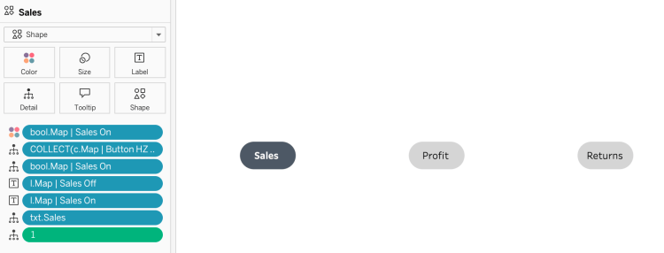
As you can see we have a dimensions measure pill of 1 in the detail mark which is there to disable the highlight that Tableau causes when using dashboard actions. You will also want to format the label and change the shape to an Oval.
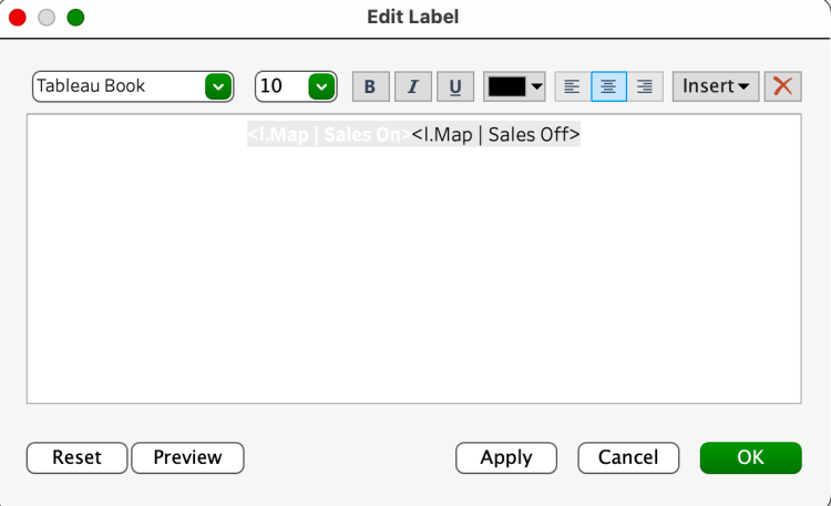
Feel free to use my oval image.
Follow these same steps for the Profit and Returns Layers to create the selectors above.
Bar Key Calculations

The setup for the Bar/Chip toggle is pretty similar however we will now need to add a Y value to the MAKEPOINT() function as this will create the height needed to show a bar.
Button Placement Calculations
This first set of calculations place the bars in the three spots:
//c.Map | Button HZ (0.25, 0)MAKEPOINT(0.25,0)//c.Map | Button HZ (0.25, 2)MAKEPOINT(0.25,2)//c.Map | Button HZ (0, 4)MAKEPOINT(0.25,4)

To create the view above you will need to:
- Drag each ‘c.Map | Button HZ’ calculation into the view and add a new map layer
- Change each mark to a Bar
- Go to Map -> Background Maps from the toolbar and select ‘None’
Now that we have the initial points plotted we just need to create calculations that will turn each selector on and off and format them how we want. Notice how when using the Bar mark this takes the height from 0 to 0.25. When using the Bar mark in Map Layers the height of the Bar will always go from 0 to that Value. You can also use negative values to.
Bar Formatting Calculations
We will use the same calculations to help format and label the buttons, plus an additional calculation for the size. These four calculations will be created for each metric:
//c.Map | Bar Size2
Since we have a gap of 2 between each MAKEPOINT() x value we will fix the size to 2 to fill this gap.
We then will follow the below steps to create the image below.
- Drag ‘bool.Map Sales On’ to the Colour Mark
- Drag both the ‘l.Map | Sales On’ and ‘l.Map | Sales Off’ to the Label Mark
- Drag ‘txt. Sales’ to the Detail mark
- Drag ‘c.Map | Bar Size’ to the Size mark

As you can see we have a dimensions measure pill of 1 in the detail mark which is there to disable the highlight that Tableau causes when using dashboard actions. You will also want to format the label like we did in the oval section.
Note: you will want to adjust your Latitude and Longitude axis to format your worksheets to make them look clean. For the bars I fix the height (Latitude) between 0 and 0.25 and width (Longitude) between 0 and 6 so the bars take up the whole worksheet
Parameter Actions
Right now we have our Oval and Bar Toggle worksheets created, so we can now create our charts and then set up our parameter actions and dynamic zone visibility (dzv) once we have a dashboard together.
To set up your Parameter Actions do the following
- Go to your Dashboard and in the toolbar select Dashboard -> Actions
- Click on the dropdown menu ‘Add Action’ and select ‘Change Parameters’
- Set up the settings like below:

Once you are finished, create the same parameter actions for Profit and Returns. Now play around with your new selectors!

Now the limits are endless with how many buttons and selectors you can create.
Additional Formatting
One big headache I ran into when doing the finishing touches of the dashboard was disabling the annoying highlight feature that Tableau does when using dashboard actions. Using the data school technique to disable highlight it works on normal charts but it kept breaking my line and area charts that were build in map layers when I would bring the ‘1’ dimension until the detail of the layer. After some digging around the answer to this was to use the attribute function wrapping the 1 instead of using it as a dimension – ATTR(1) ! This was a great work around!
Leave a Reply